Flint Scan Plotting
Bliss plotting is done through a silx-based application called flint.
This Qt application is started automatically when a new plot is created.
Flint is listening Redis database to known is there is something to display. The type is display (curve, scatter plot or image etc.) is determined using the shape of the data.
Plot types
This interface supports several types of plot:
bliss.common.plot module
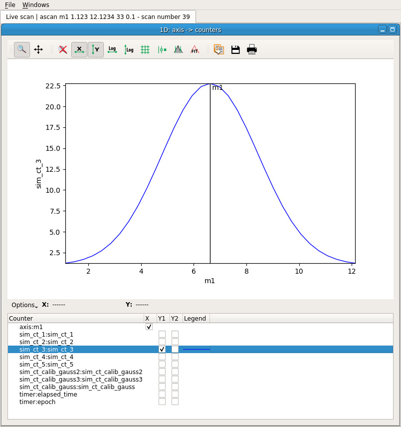
curve plot
class CurvePlot(BasePlot)
- used for
ascan,a2scan, etc. - plotting of one or several 1D data as curves
- Optional x-axis data can be provided
- the plot is created using
plot_curve
scatter plot
class ScatterPlot(BasePlot)
- used for
ameshscan etc. - plotting one or several scattered data
- each scatter is a group of three 1D data of same length
- the plot is created using
plot_scatter
image plot
class ImagePlot(BasePlot)
- plots one or several images on top of each other
- the images order can be controled using a depth parameter
- the plot is created using
plot_image
image + histogram plot
class HistogramImagePlot(BasePlot)
- plot a single 2D image (greyscale or colormap)
- two histograms along the X and Y dimensions are displayed
- the plot is created using
plot_image_with_histogram
curve list plot
CurveListPlot(BasePlot)
- plot a single list of 1D data as curves
- a slider and an envelop view are provided
- the plot is created using
plot_curve_list - this widget is not integrated yet!
image stack plot
class ImageStackPlot(BasePlot)
- plot a single stack of image
- a slider is provided to browse the images
- the plot is created using
plot_image_stack
An extra helper called plot is provided to automatically infer
a suitable type of plot from the data provided.
Basic interface
All the above functions provide the same interface. They take the data as an argument and return a plot:
from bliss.common.plot import *

plot(mydata, name="My plot")
ImagePlot(plot_id=1, flint_pid=17450)
Extra keyword arguments are forwarded to silx:
p = plot(mydata, xlabel='A', ylabel='b')
From then on, all the interaction with the corresponding plot window goes
through the plot object. For instance, it provides a plot method
to add and display extra data:
p.plot(some_extra_data, yaxis='right')
Advanced interface
For a finer control over the plotted data, the data management is separated from the plot management. In order to add more data to the plot, use the following interface:
p.add_data(cos_data, field='cos')
This data is now identified using its field, 'cos'. A dict or
a structured numpy array can also be provided. In this case,
the fields of the provided data structure are used as identifiers:
p.add_data({'cos': cos_data, 'sin': sin_data})
The plot selection is then done through the select_data method.
For a curve plot, the expected arguments are the names of the data
to use for X and Y:
p.select_data('sin', 'cos')
Again, the extra keyword arguments will be forwarded to silx:
p.select_data('sin', 'cos', color='green', symbol='x')
The curve can then be deselected:
p.deselect_data('sin', 'cos')
And the data can be cleared:
p.clear_data()